My home office is naturally where I spend a lot of time during the day. Being a lifestyle blogger, working in a ‘styled’ space only felt natural. I’ve been wanting to share this space on my blog for quite some time but wanted to make sure I got it ‘just right’ before I did.
A few things that you should know…
I originally posted a “before” blog article about my office in January 2016 (I cringe at how long ago that was). Since then, I’ve repainted, re-worked, re-configured and re-decorated everything in the space with the exception of my computer! In this article I mention how this space is open to the rest of my home, so it needs to look nice.

Why was getting this space ‘perfect’ so important to me? It’s not just that it’s visible to anyone who enters my home, it’s also because I want a relaxing and organized workspace that feels like it’s really “me”. It’s the one space in our home that is mine more than it is ours so why not take advantage of it?
Okay, enough waiting…let’s peek into the double doored entrance of this space! I’m so excited to finally share my Home Office Reveal with you!
Overall Design, Look & Feel
I wanted the overall look and feel of the space to feel both casual and elegant with a relaxed sophistication (is that even a thing?). Most of our home is designed with a modern-contemporary casual-elegant feel that mixes scandi, mid-century and modern styles and I took a similar approach with my home office.
My goal was to create a bright, clean and cozy workspace where I could feel inspired while being productive.

I like colour and I’m not afraid of it, but I like to be selective in how I use it in a space. I chose a base palette of soft greys in various textures with bright clean white pieces and accents of navy and different shades of pink.
For me the pops of colour come from the artwork I’ve chosen, throw pillows and the books, organizers and accessories on my shelves. Because the grey, white and navy base palette is so neutral, I can swap bright pieces in and out as they suit my tastes.
Deliberate Furniture Choices
The desk is the most obvious centrepiece of any office. I wanted something simple and white that didn’t feel heavy or like it occupied too much space in the room. I opted for this clean white option that features cable storage and two drawers for me to tuck things away like post-its, business cards and current personal documents. Drawers were a dealbreaker for me because I like to have as little as possible permanently on my desk top allowing me space to open books, jot down notes or review documents when I need to.

To centre the space and keep my feet cozy I wanted an area rug that wasn’t too big or too small. To add additional texture to the space but still keep with the neutral palette, I opted for this silk Turkish rug. Although it’s patterned, it’s a blend of neutral greys and silvers that fits the space perfectly. I also love how this stylish and comfortable desk chair kind of disappears into the space.
When I saw this mid-century style sofa, I fell in love immediately and knew it would be perfect in my office. Not only does it provide ample, comfortable seating – it also adds the warmth and coziness I’m looking for in this space. I was thrilled to have been able to source it locally from Showhome Furniture in Calgary. They had a number of sofas in this style (P.S. you can customize the fabric on this one) but I knew that this was the one.
I knew the neutral colour, texture and shape of this piece would serve me well for years to come. I decided to add textured throw pillows (covers: H&M Home, inserts: IKEA) in pink and navy – my two favourite accent colours. This sofa is one of my favourite pieces of furniture in my home. I love to curl up there with a good book and it’s one of Hattie’s favourite places to nap during the day!
Shelfie Worthy Bookcases
I wanted a built-in look without the price tag so I opted to purchase the shelves and accompanying doors from a big box store. To make them look a little less cookie cutter, I used different cabinet hardware and mounted the shelves at different heights for added interest. (BILLY Bookcases + ALEX Desk, IKEA)
Inside the cupboards: Did I mention that I love closed storage? Inside these cupboards is where I keep files, business and office supplies, shipping supplies, flat lay props, and of course my label maker! There is no need for these items to be on display and the doors help to hide any clutter and keep the room bright. (OXBERG doors, IKEA)
On the shelves: I like to store and display a mix of items on these shelves. I like to mix my collection of books with framed photos, candles, decorative accessories and mementos from trips we’ve taken (see source list below). The accessories and photos on these shelves are often swapped out with new memories or updates to my style.
Let’s Talk Walls
I don’t want to say that I have limited wall space in this room, but it isn’t expansive either. The room isn’t a perfect square, which means there are some angles to contend with. I also have two large windows which let in a nice amount of ambient natural light. Because storage, both open and closed, is so important to me, bookcases take up a large portion of the wall space, too. I didn’t want to overwhelm the space with framed photos, so I did opt to leave one of the walls completely empty.
Mini Gallery Wall & White Board
I’m pretty into gallery walls. I’ve done a few of them in my house and when I have the space to express myself in this format, I’ll do it every.single.time. To keep with the palette of the space, I painted all of my frames with the same gloss white spray paint for a cohesive look.

A white board to jot down ideas, create mind maps and brainstorm new projects is a must for me but I hate how the standard ones look so ‘industrial office space’. To avoid the ‘cubicle look’, I painted the aluminum frame of my whiteboard navy blue to add some contrast and opted for a picture rail to hold markers and brushes, rather than use the flimsy rail it came with.
Some Before & After Magic
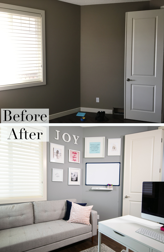
Everyone likes to see the “before and after” of a space and this one has seen quite a transformation! After re-painting, I decided to change out some of the furniture and accessories to make the space feel more modern. I also opted to accessorize the bookshelves with a mix of books, frames and other personal items rather than just books and office storage. Here are the photos!
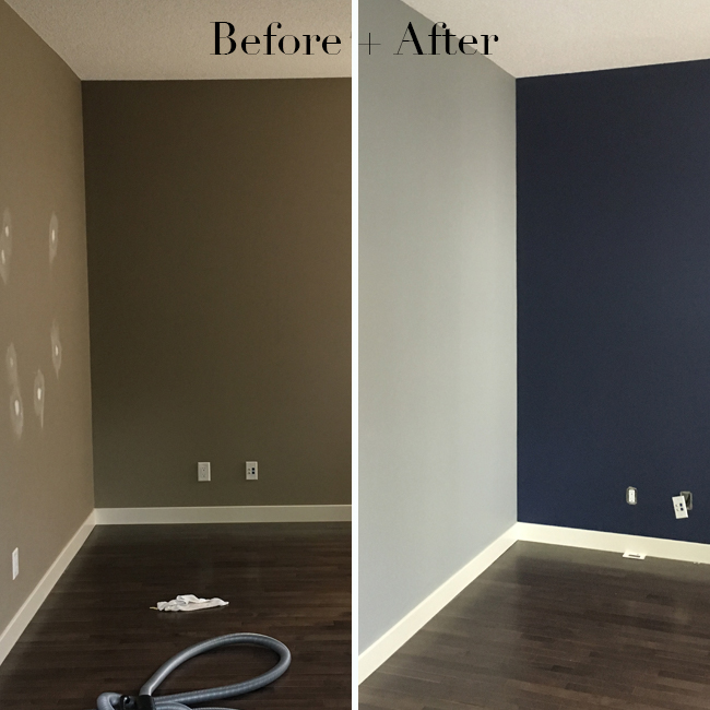
It’s amazing what a little paint can do! The first thing I did to update the space was get rid of the tired beige walls and repaint them with a more modern palette. I wasn’t afraid of the navy feature wall because I knew it would be the perfect backdrop to the white bookcases that would be going in the space.
 Paint Colours: Grey: Valspar ‘Metropolis’ (4005-1C) + Blue: Behr ‘Starless Night’ (PPU14-20)
Improving the View! I mentioned that this room is visible from the rest of my home’s main floor. This is now what you see from the rest of our house, when you come in the front door and when you walk by to the powder room.

Managing Weird Angles! This space isn’t a perfect square which made decorating and creating a functional workspace a little bit tricky. Because the door always remains open, I kept the gallery wall more condensed.

The Right Seating! Finding the right piece of seating for this space was key and this couch, although it seems quite large, fit the scale quite nicely. It’s the perfect place for an afternoon coffee!

Ample Stylish Storage Space! This little credenza just wasn’t cutting it for storage, style or scale. Adding in these bright white bookcases that I could use as a neutral palette to fill with pops of colour allows me to store everything I need while expressing my personal style.

I hope that you love this transformation as much as I do! I love being able to come and work in this space every day. It’s relaxing, inspiring and one of my favourite rooms in my home. Want to shop this space? See the source list below!
Source List:
Paint Colours: Grey: Valspar ‘Metropolis’ (4005-1C), Blue: Behr ‘Starless Night’ (PPU14-20)
Desk: “ALEX” Desk (white), IKEA
Chair: HomeSenseCanada
Computer: iMac, Apple Computers
Bookcases: “BILLY” Bookcases (white) with height extensions, IKEA
Doors: “OXBERG” Door (white), IKEA
Cabinet Hardware: Lowes Canada
Turkish Rug: HomeSenseCanada
Sofa: ShowHome Furniture
Throw Pillows: Cushion Covers, H&M Home, “FJÄDRAR” inner cushion, IKEA
Frames: Various, IKEA
Artwork: My Own
JOY letters: Wall Decor, ChaptersIndigo
Whiteboard: Amazon.ca
Shelf: “MOSSLANDA” Picture Rail, IKEA
Marker Holders: “TJENA” Desk Accessories, IKEA
Magazine Holders: “TJENA” Magazine Files, IKEA
Candles: Various, Milk Jar Candle Co.
Bookshelf Accessories: Various: HomeSenseCanada, Target, ChaptersIndigo


