I know that this space reveal has been long anticipated by many of you and I’m so so excited to share it with you. In typical ‘second-baby’ fashion, this space took a lot longer to finish than the nursery for our first little girl did, but part of that reason was that we decided to do some fairly extensive renovations before we decorated!
While I was pregnant with this little one we decided to embark on new hardwood flooring throughout our entire home (from Alberta Hardwood Flooring). This was one of the most major renovations we’ve ever lived through but it was so worth it (I’ll be sharing all this soon, too!). This project of course delayed our nursery decor! We also decided to do a mini renovation to the closet in this bedroom so that it was taller and more spacious for storage!

This room was never really used for much other than a ‘catch all’ storage space on the second floor of our home, so it was fun to take a blank space and transform it into one of my favourite rooms in our home.
Perfect Pink Walls

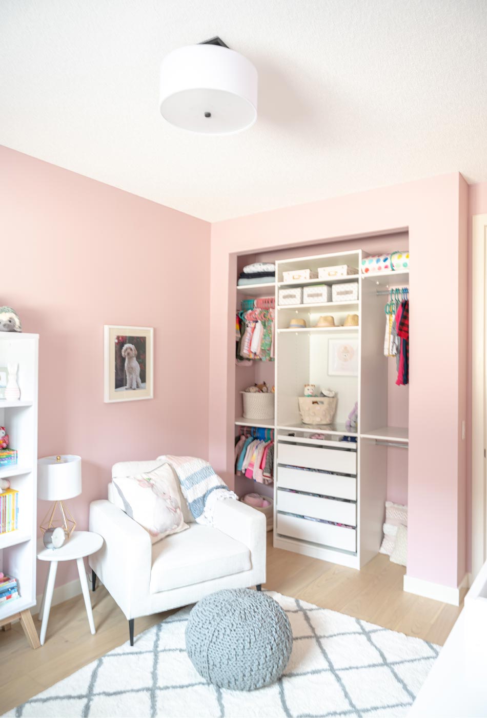
If you follow me on Instagram, you’ll know that finding the perfect shade of pink for this space was a bit of a challenge. We settled on a hue called Kept Love Letters from Benjamin Moore and it was the perfect canvas for this lovely feminine space. We actually loved the color so much that we painted our first baby’s room this colour at the same time.
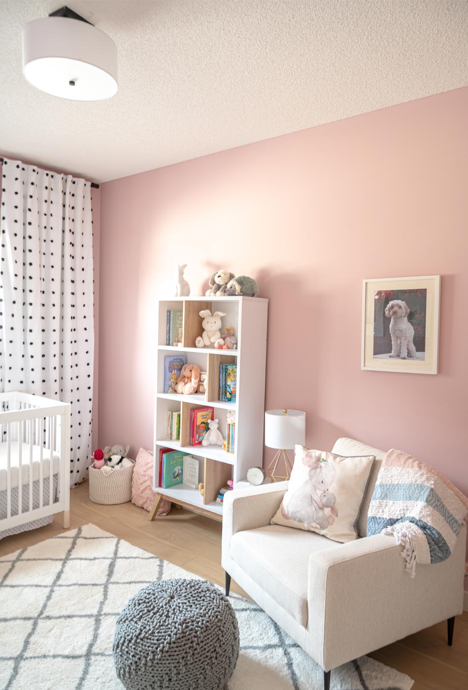
We didn’t want anything to feel too “theme-y” for the space, but rather wanted to keep everything fairly neutral in tone so that our little girl could grow with the space. We still love the ‘forest friends nursery’ feel and you can see that we incorporated a few of those elements in with the artwork and accessories (including stuffies!).
A Space to Grow Into
As soon as I found this crib, I knew it was the perfect fit for the space. I wanted something classic and white with clean modern lines. This one is all of those things – the perfect amount of classic and feminine without being too fussy and it suits our little one very much!

I am also SO in love with these curtains. We have 9-foot ceilings in our home and finding these pompom panels that were the perfect height right out of the package was wonderful. I love the extra pop of classic black and white to break up the pink walls. The pink was a big overwhelming at first and these curtains were the ideal addition to the space.
Although these panels are ‘blackout’, they aren’t truly blackout, which is why we opted to add the Lightlock blinds from Hunter Douglas (installed by Alberta Hardwood). To show just how ‘blackout’ they really are, I had to include this video!
These blinds open and close so easily and block out almost all existing light in the room when it’s time for nap for night-night! Having the blackout blinds in place, too, means that I can leave the decorative panels in place instead of fussing with them each afternoon/evening. I highly recommend these for any bedroom space!
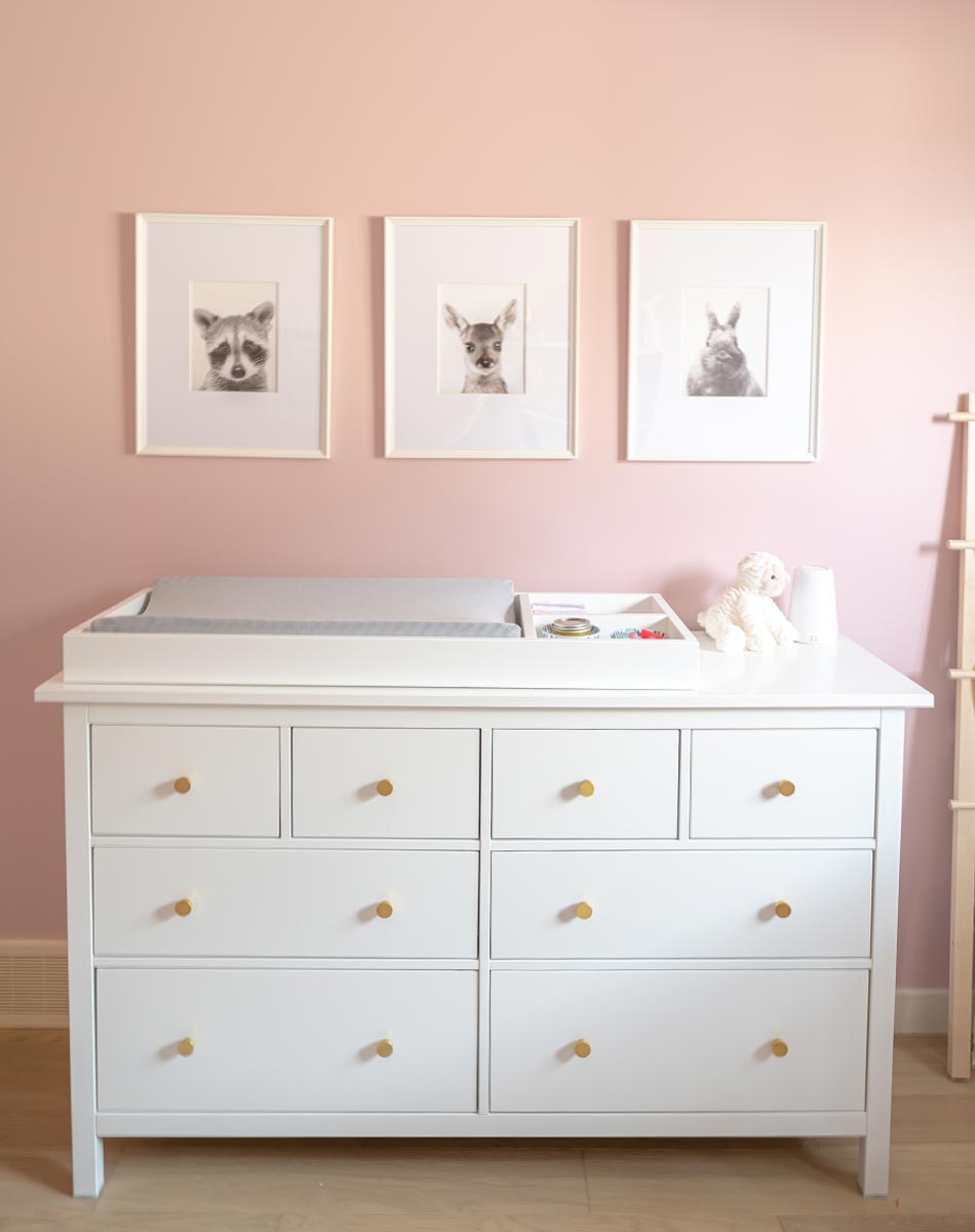
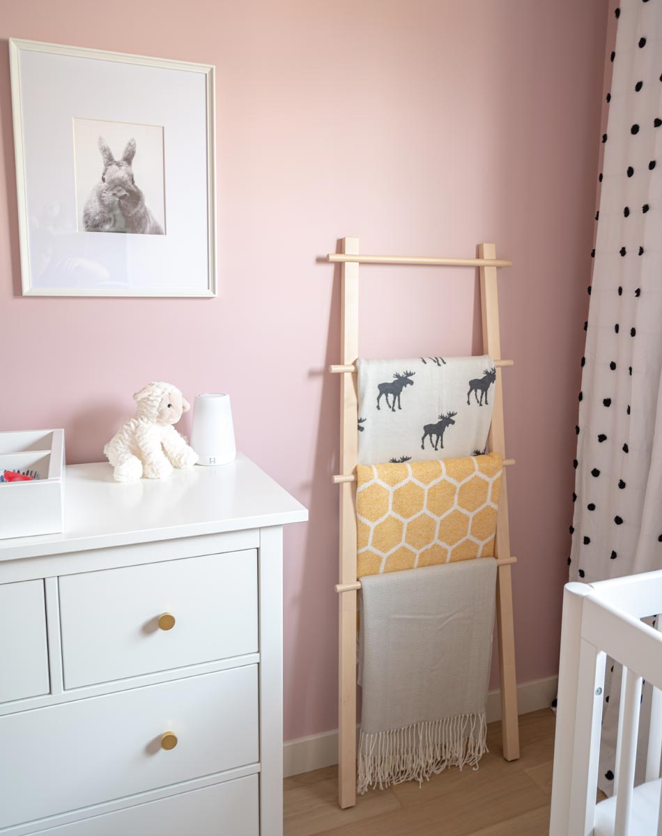
We snagged this white dresser from our previous nursery because it has so many drawers for storage and is wide enough for the change tray, too. The flat gold hardware was our way of ‘customizing’ the piece and I absolutely love how it goes with the geometric lamp on the side table. I chose these simple white frames from IKEA for these watercolour animal portraits (a small touch of the ‘forest friend’ theme!) and used custom matting to fit them (source listed below).
Adding Texture & Necessities
So many people told me I was crazy for choosing a white chair for a nursery but I couldn’t pass it up. Its textured woven ivory fabric (in a poly blend!) is really durable and easy to wipe clean. I also loved it in contrast to this woven grey pouf. Both go well with this incredibly soft trellis rug – it is so so so soft that my littles love to roll around on it. It is so comforting on bare feet, too. I placed the chair at an angle away from the closet to define the space a little better, too.
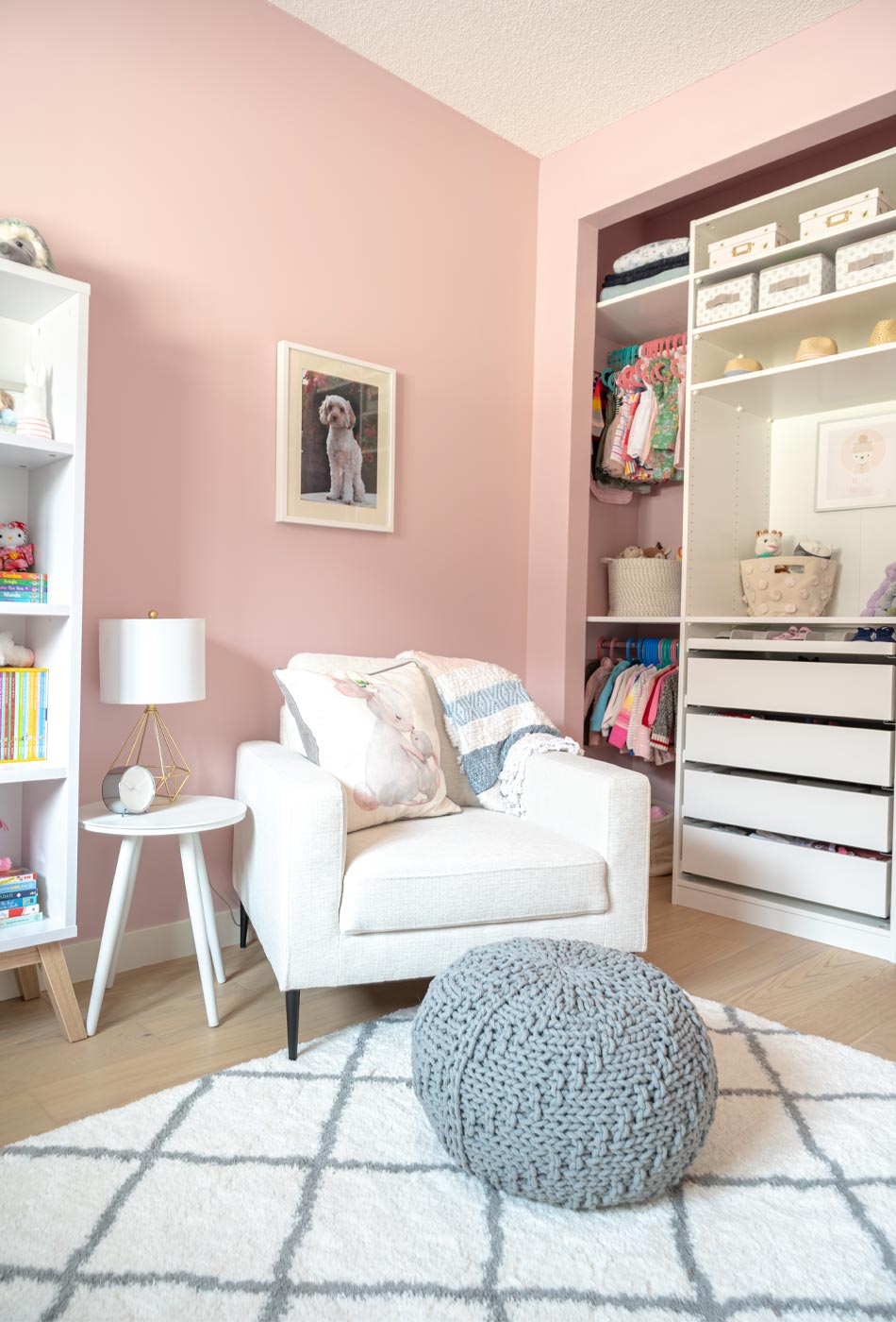
I really felt the need to add texture in this space and this pompom throw, although a little more boho than I tend to go, was the perfect compliment. I happened upon this watercolour bunny printed pillow at HomeSense around Easter – the perfect bunny addition to this nursery! If you’re looking for anything bunny-themed, the Easter season is the best time to find it!
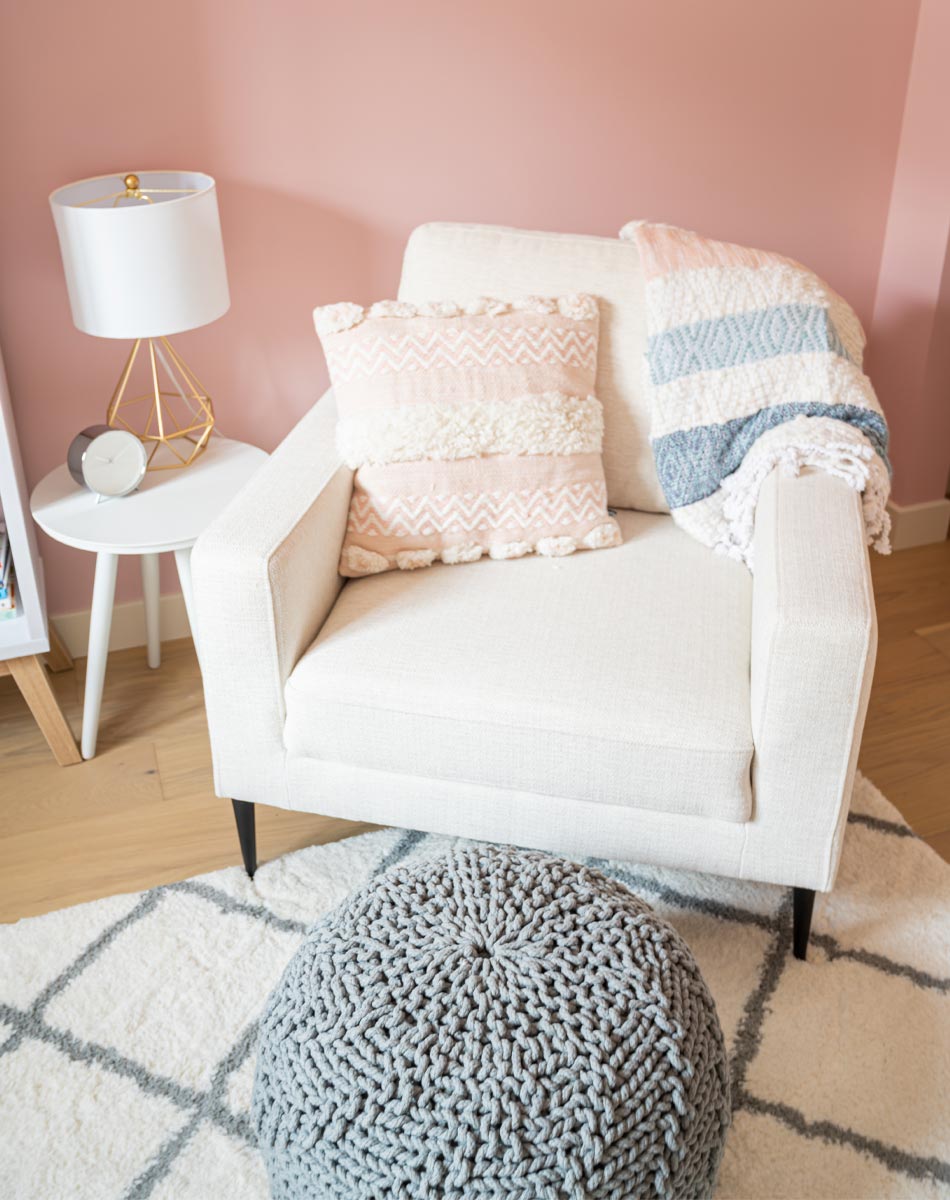
A side table is of course an absolute necessity. I found this simple white one on Article.com and it does the job without needing to be a statement piece. I fell in love with this lamp as soon as I saw it – I knew it would be the perfect fit for the space because its wire frame keeps it from feeling too heavy.
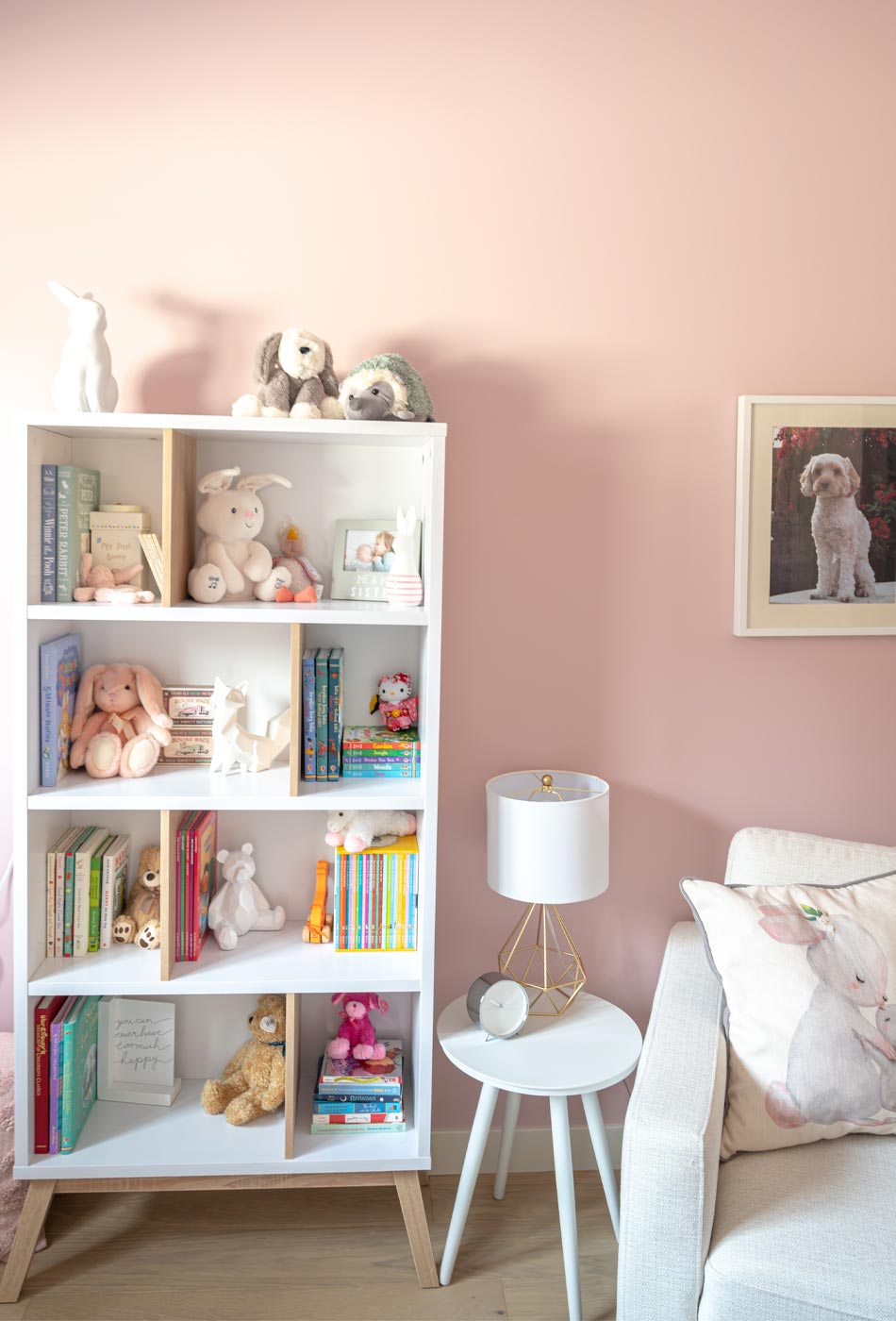
Space for a bookcase in a nursery is an absolute must for me. It isn’t just about a space to store books, but also somewhere to display keepsakes and other fun trinkets for my little ones. I love how the white oak legs and dividers on this simple shelf match the aesthetic of the crib. The mid-shelf dividers add some interest and make for an easier space to decorate!

It can be difficult to fill corners in a room like this, and again in my desire to add texture to the space, this blanket ladder felt like the right move. I was able to add some colour and interest, too. The moose printed blanket plays into the ‘forest friends’ theme and the honeycomb yellow throw is cozy and helps add a touch of colour to this corner.
On the other side of the crib, I have woven toy baskets with fun stuffed animals and Cuddle & Kind dolls. This textured pillow also covers up the electrical outlet enough to keep curious little hands away from plugs!

The Spacious Closet
Storage is a must-have in any space for me, so taking this closet from its 7-foot high opening to over 8 feet was a game changer for accessible space. I’ve shared how we built this closet (a simple IKEA hack!) in another post – click here for those details!
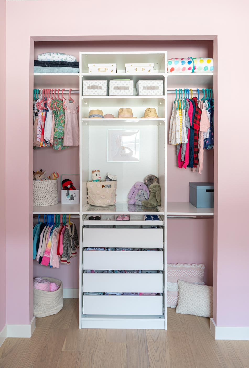
I know this closet doesn’t have doors right now, but I don’t think it needs them. If we want to close it in down the road, we have the option to do so. This 75cm wide IKEA PAX Wardrobe gave us the building blocks to start – and its interior fittings of drawers with dividers and a glass shelf on top make the storage space feel luxe. And because baby clothes are so tiny when they’re hung up, having the shelves and the floor space below to fill with baskets of toys and other items is ideal.

Because we have so much hanging space, I was able to create this little “niche” space in the centre where I hung an inspirational print from Cuddle & Kind and I can arrange ‘fancy’ stuffed animals. I added this pompom bin from Pehr designs for a pop of fun and texture, too.
Source List
Paint Colour: Kept Love Letters (Benjamin Moore)
Flooring: Alberta Hardwood Flooring
Rug: Grey and Cream Trellis Rug (HomeSense)
Blinds: HunterDouglas Lightlock Blinds (Alberta Hardwood Flooring)
Curtains: Pom-Pom Applique Blackout Curtain Panel (PotteryBarn Teen)
Curtain Rod: Matte Black (HomeSense)
Closet: PAX System (IKEA) + Custom Shelves, Bars
Crib: Babyletto Gelato 4-in-1 Convertible Crib in White (buybuy BABY)
Dresser: HEMNES (IKEA), Hardware: Project62 Knobs (Target)
Change Table Tray: DaVinci Removable Universal Changing Tray (buybuy BABY Canada)
Lamp: Wire Gold Geometric Lamp (HomeSense)
Bookshelf: Mcneeley Geometric Bookcase (Wayfair)
Chair: Teresa Arm Chair in Cream (Structube)
Blanket (on chair): Mini Pompom Throw (Maison Simons)
Side Table: NLA (Article)
Pouf: Roper Poof in Grey Mist (Urban Barn)
Bunny Lamp: 11″ White Rabbit (Wayfair)
Blanket Ladder: Bathroom Department (IKEA)
Blankets (on ladder): Honeycomb Throw (Maison Simons), Moose Throw (HomeSense), Knit Herringbone Throw in Beige (Wayfair)
Throw Pillows: Textured Chenille Cushion in Dusky Pink, Ivory Knit Cushion, Boho Elegance Cushion (All: Maison Simons)
Baskets: Pehr Designs (Indigo), Misc (HomeSense)
Accessories: Jellycat Stuffed Animals (Indigo + Mastermind Toys)
Artwork: Watercolours NLA (Indigo), Inspirational Print (Cuddle & Kind)
Frames: RIBBA & KNOPPÄNG (IKEA), added custom mats (Opposite Wall)
Sound Machine: Hatch Baby Rest Sound Machine Night Light & Time-to-Rise (buybuy BABY)


