Have you ever wondered what goes in to designing a space in one of IKEA’s stores? I had the rare privilege of being a guest designer for one of IKEA Calgary’s “Dream Spaces” and I got to be behind the scenes for the entire project! This was such an amazing experience that I wanted to share this peek behind the curtain with you!
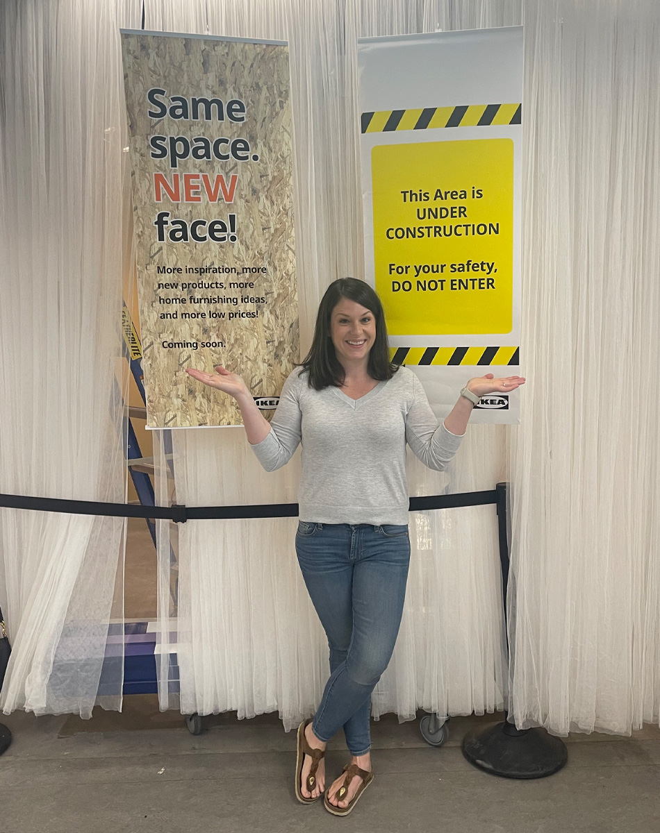
This particular space at IKEA Calgary is located in the living rooms department and takes up a corner display, allowing for ample square footage of design! To be given such a large canvas to work with was a huge opportunity.
The Space Before & The Demo!
The space had not been touched for quite some time and upon looking at it, I already knew what changes I wanted to make!
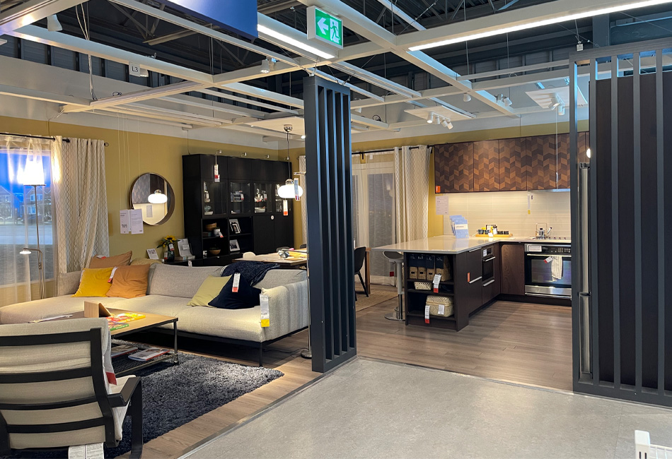
IKEA’s team demo’d the entire space, leaving me with a blank slate for my vision. Once all of the original elements were erased and we were able to build from scratch, it really got exciting!
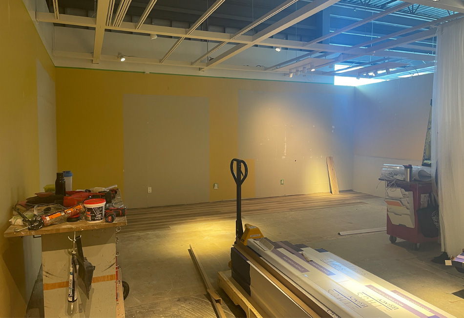
The Design Concept
Because this installation is at IKEA Calgary, I wanted the space to feel like a Calgary home to inspire local homeowners and help them see themselves in the space. I was able to find a balance between making this an aspirational design with functional elements.
For me, design is all about creating a space that is both functional and beautiful; a space that you can live in with your family, comfortably.
I was very deliberate in my design choices and wanted to ensure that this was a space that could be lived in with a real family. It was also important to me to show that just because you have small children (like I do!) that you don’t have to sacrifice great design until they’re older.
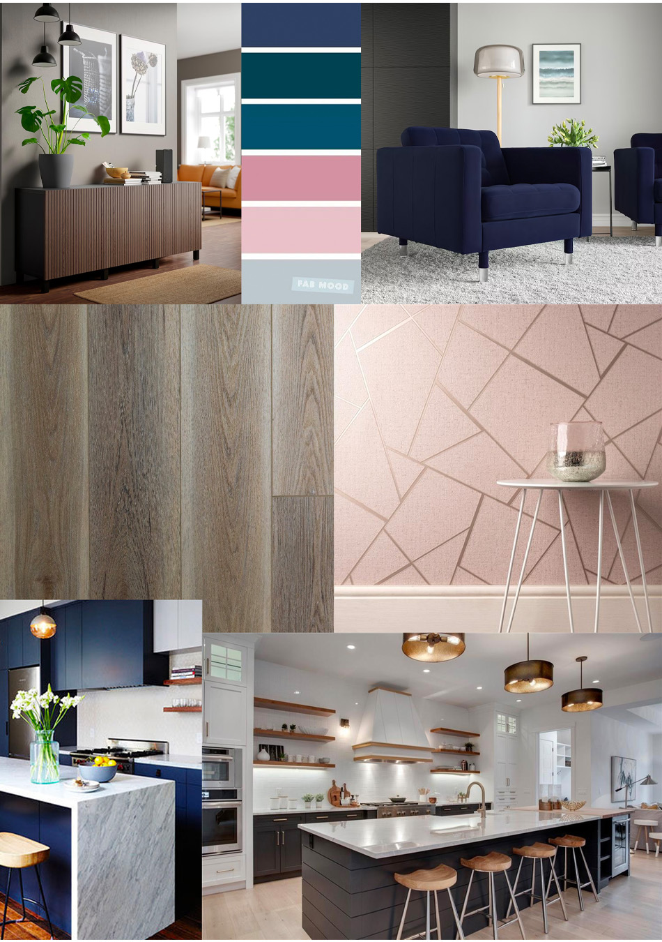
I wanted something to incorporate elements of my own home and my own personal style. I love a mid-century modern aesthetic but never want to go overboard with one style in a home, either. I added these touches throughout the space in a thoughtful way. This is something I getting into detail with in my other posts on this project!
IKEA Requirements vs. Creative Control

IKEA let me choose every one of the finishings in the space, right down to what was featured inside the cabinets! BUT, like any design “client” (in this case, IKEA), there were a few requirements that I had to work around. These dealbreakers weren’t crazy, but included the kitchen cabinet colour (this is a big one), the sofa (with my choice of upholstery), the location of the living room and the use of their BESTA storage (in the capacity of my choice).

Local Flooring & Tile
We all know that IKEA doesn’t sell finishes like flooring and tile, but they’re a requirement for any space. They allowed me to lean on my friends at Alberta Hardwood Flooring to source flooring and backsplash tile for the space. I was able to work with the same designer there who helped me choose the hardwood flooring for my own home.
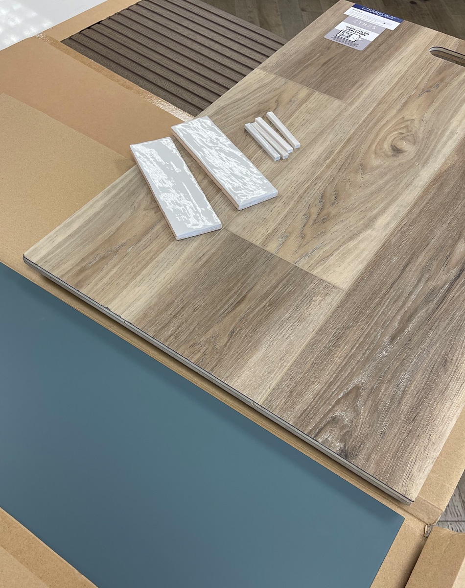
The particular flooring that I chose was is the “Megan” flooring from their Ethos collection that has been featured on HGTV’s Property Brothers Forever Home. More on this in another post!
The IKEA Design Experience
What many don’t realize is how much really goes into designing these spaces, and then how quickly they come to life once the design is complete. Then, once everything is installed, everything myst be tagged so customers know where to find each product that was incorporated.

The entire experience was really interesting for me and to be able to work with a team who can took my vision and made it come alive was incredible! It sure beats DIY, I’ll tell you that haha! Some parts of this experience really made me feel like a celebrity designer on a HGTV show where I got to make all of the decisions, I had to pivot when things weren’t available and then got to do a reveal to an audience!


