There’s no question that white oak is everywhere right now, and it has been for a few years. It doesn’t show any signs of going out of style anytime soon and I think that’s because it’s classic style offers warmth, quality and neutrality that lasts. I was fortunate enough to shoot some content in this Wolf Custom Homes show home in Watermark before it was closed to the public.
This home features some bold design choices, high contrasts between black and white and a lot of warm wood tones throughout that make it feel like a mix of west coast cool with homey Scandi vibes.
Luxury Living Room

I love this living room for a few reasons. I love the high ceilings and the fireplace detail with the mix of wood and marble. The simple yet statement-making chandelier is also lovely. I also love the high-contrast of the black built in shelves. So often living rooms are devoid of much needed storage/display space and these offer a nice mix of both open and closed storage (a must for me).

Can we talk about this coffee table for a minute, too?! I love that it is unexpected. The dark brown and gold offer some warmth to the space and I love that instead of chairs, the designer opted for a bench to maintain the open flow into the space.
Dedicated Dining Space

This dining space is lovely. It sits between the living room and kitchen and is defined nicely by the pendants above it. It maintains the open flow between the spaces without needing to be in its own closed area. To the right, double sliding doors open to a covered and screened in three-season room that extends the space further.
High-Design Kitchen

The design choices in this kitchen in are nothing short of bold. I love the contrast of the black marble counters and matching marble-clad vent hood. The mosaic of glass tile feels like it fits well with the mountain views that the home offers and the sconces are unexpected but a really lovely choice in a kitchen.
A Polished Pantry

I am loving the return of high-design butler’s pantries in homes! This gorgeous space carries the black marble counters from the kitchen but atop matte black cabinetry with glossy handles. The entire space feels moody and rich and I can’t get enough. The white grout allows this horizontal picket tile pattern to really pop and is also emphasized by the white oak floating shelves for extra storage.
An Opulent Office Space

This area feels high drama with all of the contrast that it offers. The home office is hidden behind these double white oak doors that are cased with black built-ins. Again, I am loving the contrast here. The doors feature the same design as the wood in the fireplace detail, offering consistency throughout.

I’m not going to lie – I am obsessed with these black walls and how they pop with the caramel toned leathers and white oak wide-plank floors. If you’re looking for more moody wall colours, check out this other blog post here.
An Airy Ensuite

There isn’t as much obvious contrast in the ensuite as there is in the rest of this home, but if you look, you’ll find it. The crisp white walls feature warm white oak floating shelves and instead of going all-white in here, the shower is a mix of blacks and charcoals.

The “greige” tile allows the lightness of the home’s flooring to carry through into this space and offers a wood-feel texture. It is the perfect setting for this white oak vanity.

The matte black faucets and contrasting cabinet hardware add a little extra pop to an otherwise white-washed space.
A Marvellous Master Closet

The black, white and oak tones continue into this master closet filled with custom shelving, cabinetry and even a peninsula for folding and bench for sitting back to admire your wardrobe!
A High-Style Main Bathroom

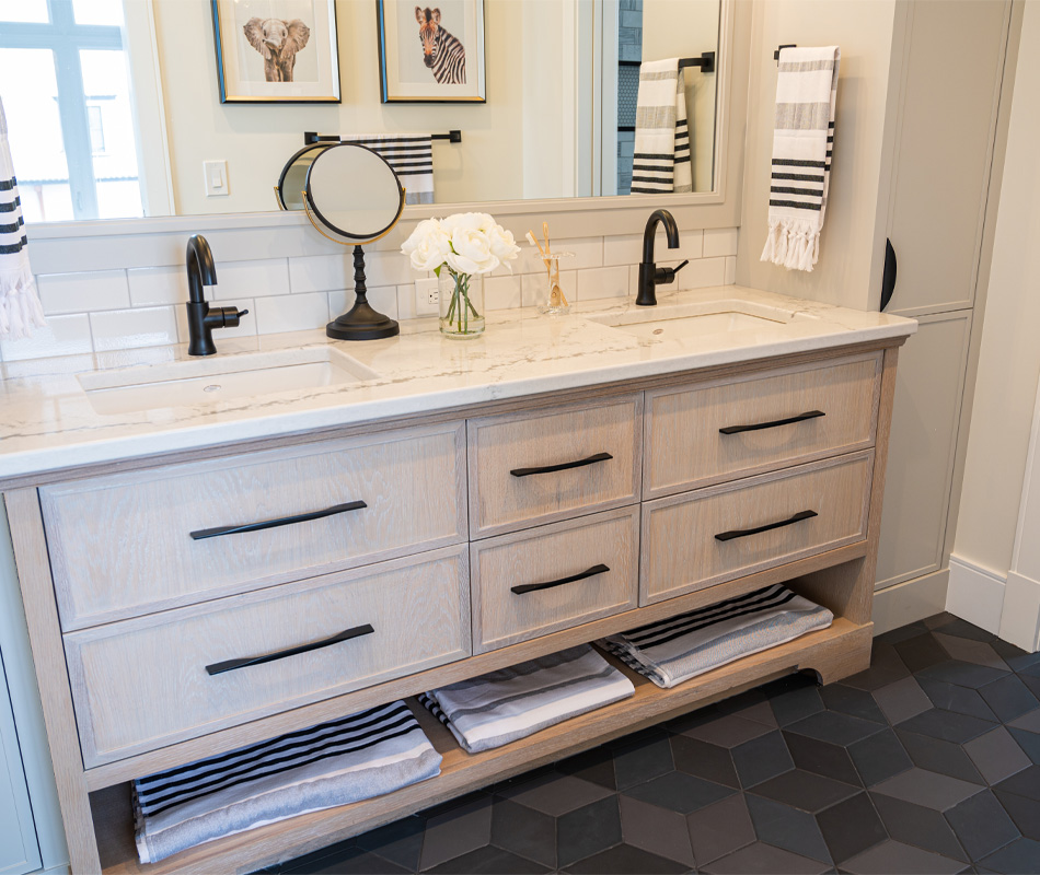
Instead of continuing with the white washed floor tile in the ensuite, the home’s main bath features a gorgeous geometric hex tile patterned with varying black and charcoal tones. It’s fun and playful and still keeps with the high contrast vibes of the home.


