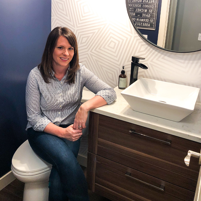
The drama is over! The renovation is complete and I am SO excited to share with you my Powder Room! My vision for this space was something dramatic but in keeping with the casual-elegant vibe of our home. I wanted to ‘wow’ guests and to also start making my home feel less ‘cookie-cutter-builder’ and more ‘custom’.

For whatever reason, the smallest room in my home was the most painstaking to renovate (you can read more about that here), but it’s over and I’m thrilled with the result. I’m sharing all of the glorious photos with before-and-after shots for the full effect.

Step-By-Step: I’m going to show you the before-and-after of this reno in the order of installation as well as why I chose the items that I did. All photos will have shop links for you, too!
The Straight Up Before Picture
To begin with, our powder room was only a slight step up from ‘builder-grade-basic’. We had a small toilet and a pedestal sink. The only point of interest was that our wall sconce was mounted through the mirror! Our home boasts 9 foot ceilings on all three floors and the tall mirror definitely took advantage of that…however, it was so narrow that it made the room feel incredibly narrow, too.

I honestly felt like the space needed something more. This is the only bathroom on our main floor and I wanted it to feel spacious and modern. I also wanted to add some much-needed storage on top of choosing more ‘grown up’ fixtures.
Step 1: Demolition
Demo’ing the space wasn’t all that difficult. I won’t share the details in this post but you can catch them all in my Reno Woes post where I go through how we did our demo, what we did with all of the old fixtures and more.

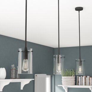
Post-demo, the first thing we did was bring in an electrician to move the light junction box from the wall to the ceiling as I wanted to change the location of the room’s light fixture. I no longer wanted wall-mounted lighting, but instead a three bulb set of pendants. I found a great antiqued rubbed bronze fixture with plans of using Edison bulbs.
 Shop: Light Fixture | Edison Bulbs
TIP: I used standard LED bulbs during construction (they’re less fragile!) and replaced them with LED Edison-Bulbs once everything was completed.
Step 2: Setting the Scene
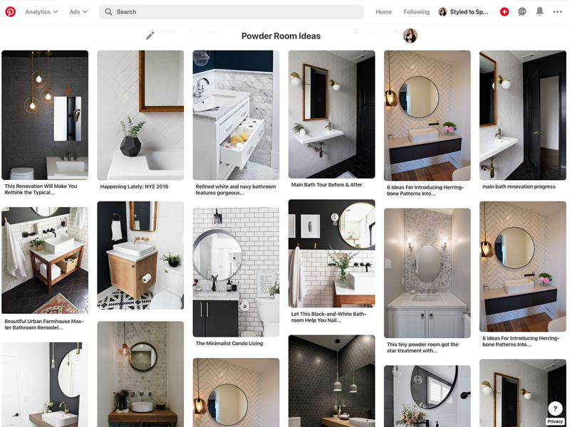
My goal was to execute a space that exuded casual elegance with a ‘wow factor’. I scoured Pinterest for ideas and ended up combining a few different ideas that I saw to create my own design.
I sketched a few different angles of what I thought the space would look like on graph paper (I’m old school like that). Once I’d made some high level design decisions, I logged onto Wayfair to see what they had to offer to make my vision come to life…
It All Starts With Colour
I wanted to do something dramatic in the space and I knew that one of the only places I could get away with something like this in our home would be the powder room. I opted for a deep indigo paint shade (Behr PPU14-20: Starless Night) but in a semi-gloss so that it would better reflect light in the space, rather than absorbing it.
 Shop: Wallpaper | Light Fixture | Edison Bulbs
I also wanted a bright feature wall that would really pop against the indigo walls. I found a great traditional wallpaper product on Wayfair and had someone come to install it for me. Note that we hit a few snags on our first wallpaper attempt which you can read about here.
Step 3: Installing the Main Fixtures
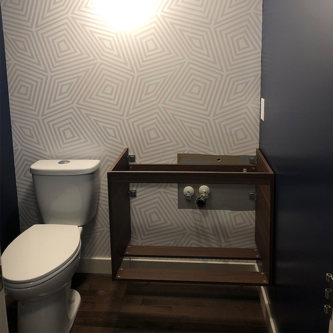
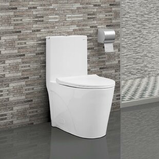
Toilets are pretty straight forward. We opted to swap out our old small toilet for a larger, low-water model with an elongated bowl. The overall style of the commode is much more modern and the scale is more appropriate for the room.

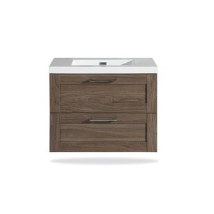
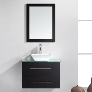
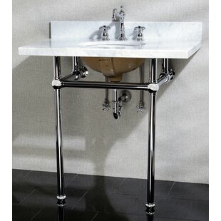
We switched from a pedestal sink to a vanity for a number of reasons. I felt like the pedestal felt a little ’90s and I wanted more storage. I knew that a 30″ wide vanity was pushing my limits for the space but I went for it anyways. Rather than feeling crowded, it makes the room both appear and feel larger.
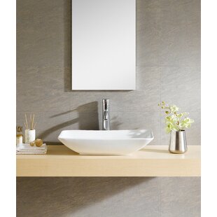
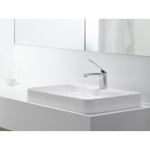
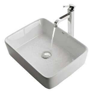
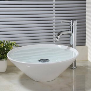
I’m not a huge fan of vessel sinks in ensuites and main baths, but I love them in powder rooms. I went with a square-shaped, medium depth vessel sink and an antiqued rubbed bronze faucet (to match the light fixture).
I sourced a piece of white and grey quartz from a local supplier. The available counter space isn’t huge, but it doesn’t need to be because it’s a powder room.
TIP: For small jobs like this, you can often find a remnant piece of stone that can be cut to spec for your space for a low cost.
Step 4: Finishing Touches
I love round mirrors and I felt like a mirror as wide as the vanity (30″) would fit in well in the space. I also felt like so much of the room felt very linear (a lot of straight lines, geometry, etc.) and felt like the round mirror might soften the space a little. It also felt like it vibed well with the quasi-mid-century modern feel I had going and the dark frame provided a bit of contrast on the otherwise bright wall.
 Shop: Mirror | Light Fixture | Edison Bulbs | Sink | Faucet
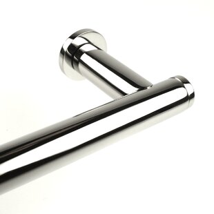
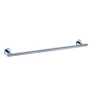
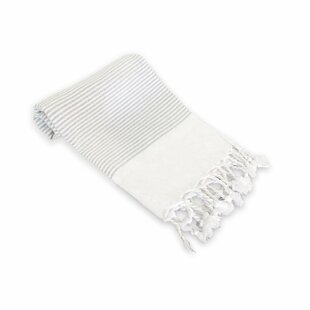
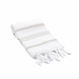
I wasn’t super matchy-matchy in this space, but I was when it came to the towel bar and tissue hook. I wanted them to match because they are in the same ‘family’ of items. Originally the space had brushed satin nickel fixtures. I swapped them out for a thicker gauge of bars in chrome. I also ditched the plush traditional towels for lightweight Turkish Cotton Hand Towels and opted to not hang art on this wall.
 Shop: Towel Bar | Turkish Hand Towels | Tissue Hook
Step 5: Love Your Powder Room
I tried to keep extras to a minimum in this space, opting for only one piece of art. I wanted to let the fixtures and the design details speak for themselves.
To be honest with you, I feel like updating our powder room has made the entire main floor of our home feel updated and fresh. I’m so glad that I opted for slightly larger fixtures to really make the powder room feel more grand. I gained storage and the illusion of more space!
