When we built our home over 10 years ago we made sure to do a few things right the first time around. We opted for a tile tub surround rather than a fibreglass one – this cost a little more, but we knew it would make sense in the long run. It was also a great way to emphasize the 9-foot ceilings upstairs. We also upgraded our countertops from laminate to granite and went with a solid wood vanity rather than something less expensive.

With regards to style, keep in mind that this was ten years ago and styles change…we chose beige-taupe coloured walls and neutral beige-brown 12″x12″ tiles and grout in a similar colour. This bathroom now just felt dark, brown, dated and oh.so.boring. and after ten years it really just needed a refresh! Here’s what we did to update our main bathroom:
Our Renovation Design Plan
This bathroom is the main bathroom for the bedrooms upstairs (excluding the Master Bedroom which has an ensuite). With the pending arrival of our first child, we figured that this was the right time to get this renovation done – it gave us an opportunity to ensure all the dust was out of the area and start with a fresh, clean palette for baby’s bathroom!

Our goal was to get rid of everything brown and brighten up the space with a new palette of clean whites with contrasting pops of black. We opted for a classic glossy white elongated subway tile for the tub-shower walls and sink backsplash, a glossy black subway tile for added contrast in the new shower niche, and a fun white hexagon tile on the floor. We used a dark charcoal-black grout throughout to make the white tile pop and match the contrast of the dark vanity cabinet and counter.
The Results of Our Renovation!
This renovation really felt like it brightened up the entire upstairs hallway of our home. Now I walk past this bathroom and am excited to see how light, bright and modern the space is! It’s amazing how some small updates can make your home feel brand new again!
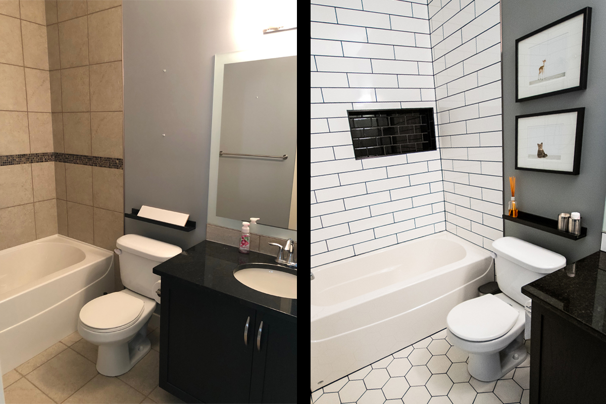
An incredible transformation like this was not as difficult as you might think. Keep reading for all of the before and after photos, design decisions and project source list!
The Tub & Shower Combination
The bathtub was in fantastic condition, so there was no need to swap it out for a new one. Plus, when we built, we ensured to get the largest, deepest tub that would fit in the space. This helped keep costs down as well as saving us additional time and effort. All we had to do was pull out the old tile, replace the sheetrock and we were set to install the new tile!

We added a niche detail to the shower wall for additional storage as well as an element of contrast. This was an easy thing to frame in as the studs were already exposed from removing the old tile and sheetrock. This is the only structural change that we made to the space and I think it was well worth it.

We chose a glossy black subway tile for the niche detail to add contrast and interest to the otherwise bright white walls. I love the way that the high shine of the black subway tile matches that of the countertop.

The change from a matte beige tile to a glossy white wall tile has added so much more light to the space. I can’t get over how much brighter the room feels, especially considering there is no source of natural light here.
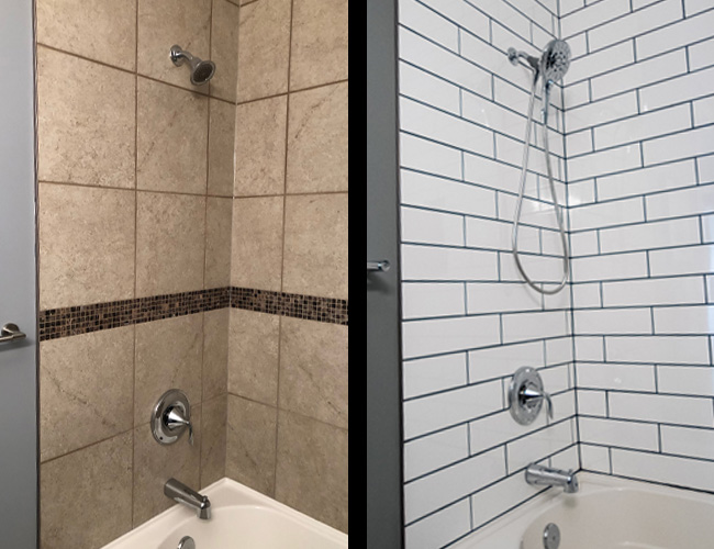
We kept the existing tub-shower faucet but opted to update the shower head with a larger, hand-held version. This is a great choice for bathing children and pups and cleaning the shower walls! This particular shower head attaches to the base magnetically making it easy to take on and off for bath time.
The Floor Tile
I wanted to do something a little more fun with the floor tile but was torn between the patterned cement tiles that I see everywhere and something more simple. I opted to stay in the black and white palette of the rest of the design hoping that the look would be modern and timeless.
Before & After
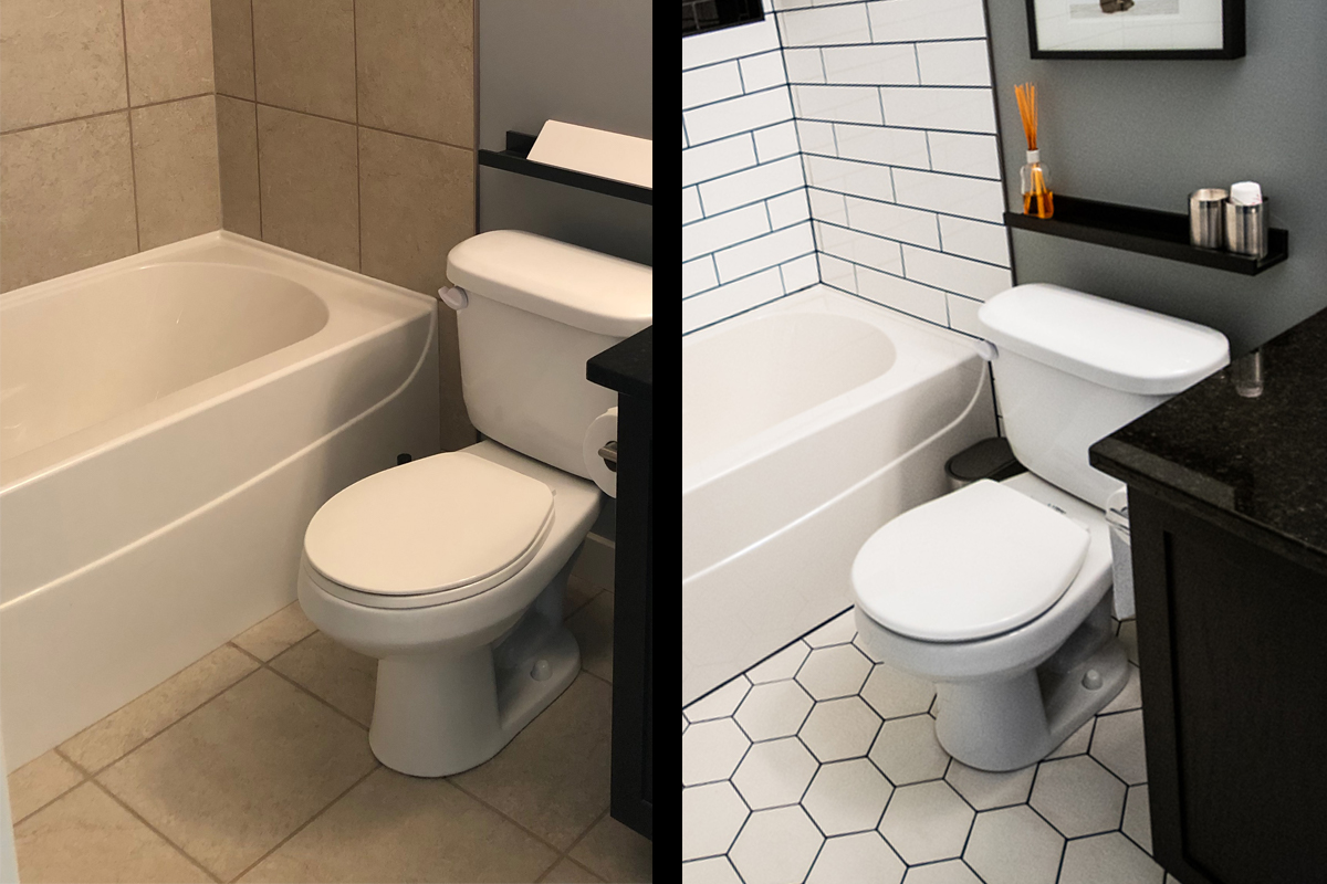
The updated floor tile from a 12″x12″ square tile to this modern 5.5″ hexagon tile really changes the space. Because this is technically a bathroom for kids, we wanted to play around with a fun shape, but still keep things clean, classic and modern so the space can grow up as they do.
The Original Vanity
There was no sense in replacing the vanity or the existing granite countertop and I couldn’t bear to paint the stained oak, so we opted to work the design around it. I am so happy with how the dark vanity and counter pop against all of the white tile while also anchoring the space.
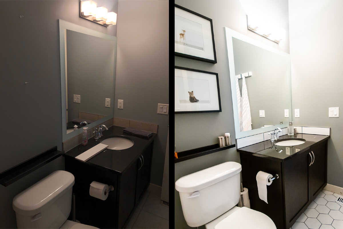
One of the first tiled areas that we demolished and replaced was the sink backsplash. I couldn’t get over how much it immediately updated the space and how nicely it contrasted with the existing vanity and countertop! This let me know that we were on the right track and our design plan would be a success.
Artwork & Finishing Touches
I wanted this bathroom to be fun and modern but also classic and elegant. I’m not one to make spaces too ‘busy’ with artwork and accessories as I believe in everything in moderation. Simple black frames felt like the right choice to keep with the contrasting design palette and help the artwork to pop on the neutral grey walls.

We added a photo rail to act as a shallow shelf for miscellaneous items that would otherwise reside on the countertop. Again, because this is the “kids'” bathroom, we chose fun artwork but in a black and white palette to keep with the modern feel of the space. The artwork itself can be inexpensively swapped out for something more ‘grown up’ as the kiddos grow.
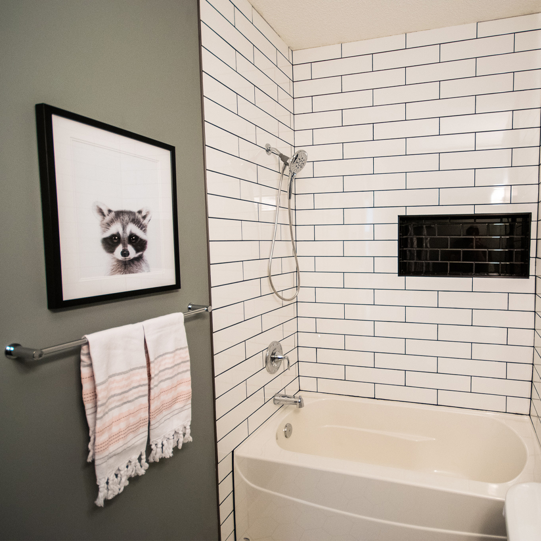
As the taps and plumbing fixtures were already chrome, we swapped out the dated brushed nickel towel bar and paper holder for more sturdy and modern chrome versions. I’m currently obsessed with Turkish Hammam towels and have them in every bathroom in our home. I love the texture that they add to an otherwise stark space.

We also added a set of hooks for hanging towels and robes behind the door. This particular set of hooks folds up when not in use so they aren’t obtrusive in any way. I prefer a row of hooks on the wall rather than on the back of the door because there are more options to choose from.
How To Do a Bathroom Renovation
On a Budget!
This renovation really didn’t cost us a ton of money because we didn’t replace anything major – we just made cosmetic updates. What made this bathroom renovation much less expensive was the following:
#1: Paint: Painting is the easiest and least expensive way to transform a space and this room was no exception. Just updating the paint colour from drab and boring brown to a blue-grey updated it considerably. Maybe all your bathroom needs is a fresh coat of paint!
#2: Tile: The only thing we demo’d in the space was the tile. We left the mirror, the vanity, the existing bathtub, etc. Simply updating the tile allowed us to create a major change and brighten up the space.
#3: Vanity: The bathroom vanity is ebony-stained solid oak with a black granite countertop and under-mount sink. Rather than replace something expensive like this, we worked our tile choices around the vanity colour to really make it pop.
TIP: If your vanity feels dated, try painting it or switching up the countertop for something more modern.
#4: Fixtures: We kept the existing mirror, light fixture, toilet, bathtub and faucets but we updated the shower head (to a larger hand-held version) and swapped out the dated towel bar and paper holder for a more modern chrome version (you might remember these same ones from our Powder Room Renovation).
TIP: Items like mirrors, light fixtures and towel bars can be sourced at a budget-friendly cost and can really help to update a bathroom.
Source List:
Paint Color: Grey: Valspar ‘Metropolis’ (4005-1C)
Tile: Tile & Stone Source
Fixtures: Shower Head, Faucets (Moen, Lowes Canada)
Hardware: Towel Bar, Paper Holder (Wayfair.ca), Hooks (Richelieu), Photo Rail (IKEA)
Artwork: Racoon (HomeSense Canada), Art Prints (ChaptersIndigo), Frames (IKEA)
Bathroom Accessories: Trash Can, Toilet Brush, Paper Roll Holder (IKEA), Foam Soap Dispenser (Amazon), Steel Canisters, Towels (HomeSense Canada)


