I know I’ve shared a few blog posts on the renovation of my pantry, mud room and laundry spaces, but I figured one more can’t hurt! The real reason I’m including this final post is because I wanted to show you how the three spaces fit together. When we set out to renovate one space (the pantry), the project inevitably spilled into the other spaces as they’re all kind of in the same “room”.

Removing walls, opening up the space, brightening it up and just changing it overall was a big job, but in the end, so, so, SO entirely worth it. If you’re looking for the renovation details, or specifics on all three spaces, I’ve listed everything with links below. I’ve also included a source list in case something catches your eye!
The biggest changes we made were removing a couple of small walls and adding new lighting (recessed LED pot lights). My excitement of removing a couple of small walls was really rooted in my desire to change the flooring in the space (a wonderful inevitability in this kind of reno). The new tile flooring made the whole space feel fresh and bright!
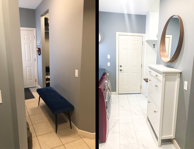
Opening up the sight lines through the entire space made it immediately feel larger. Now rather than the pantry being a cut-off space from the rest of the mud room, the entire room flows cleanly from one end to the other.
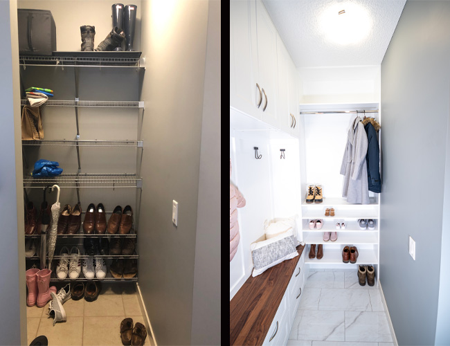
We could have just redone our pantry and left the existing shelving in the mud room closet and laundry room, but we’re not half-way people. We knew if we were doing this, we were going to do it right from the start. Now when I walk into the space, it’s like it’s always been this way.
A walk-through laundry room isn’t always ideal, so I wanted to make the most of the available storage space. I could have left the hallway open, but opted to add this shoe cabinet for extra storage. Not only does it add extra storage for shoes, the drawer on top is perfect for sunglasses, doggie bags and keys. The top is also a small, but much needed catch-all space for mail and other things.
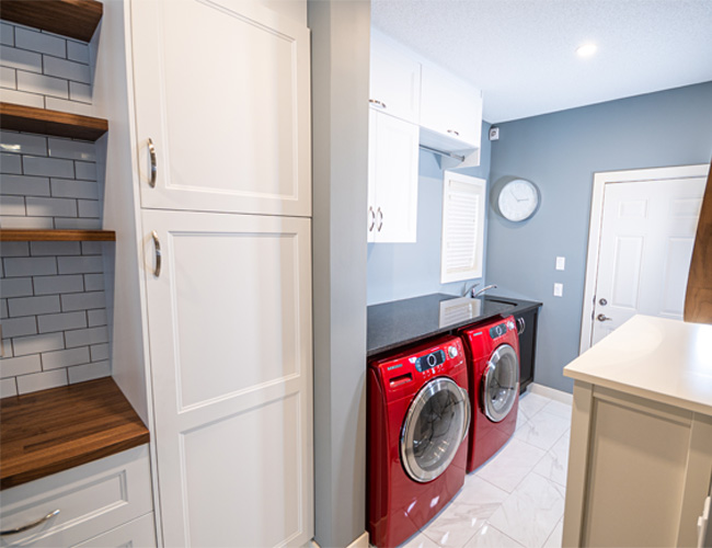
A contiguous space was important to me and I achieved this by doing a few things:
- I used the same paint colour throughout.
- All new cabinetry is the same white shaker-style cabinetry. Any custom shelving was painted to match.
- All cabinet hardware is the same throughout. The only exception to this are the drawer pulls on the shoe cabinet, but they are the same brushed steel as the cabinetry handles.
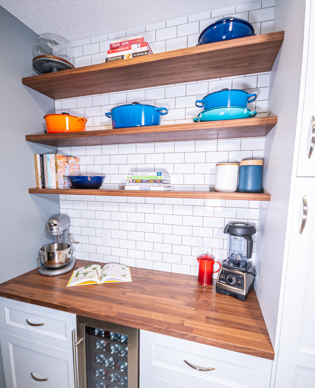
- I added a touch of walnut in each of the spaces: In the pantry, it’s the counter tops and floating shelves; in the laundry room it’s the frame on the mirror and the letter board; in the mud room, it’s the counter top used as a bench seat.
- We used the same marble-look porcelain floor tile throughout the space.
Additional storage is one of the main themes of this project and I could not be more pleased with the final result. Although it appears at first glance that I eliminated a lot of shelving, I replaced it with more useable, functional storage. Finally there is a place for everything…and everything in its place.
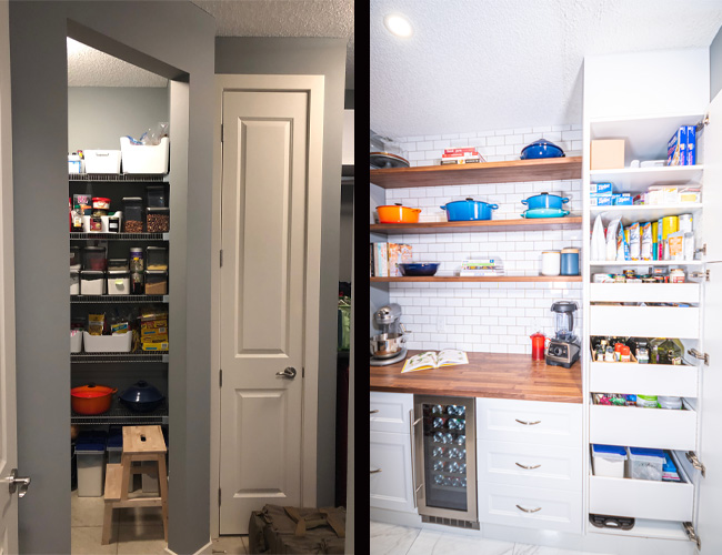
The room that really kickstarted this entire project was the pantry. I hated the wire shelving (which I have said more times than I can count on this blog) and the entire space just felt like a giant mass of clutter that gave me some anxiety. I don’t like having spaces in my home that I hate going in to or that I find to be an organizational nightmare, no matter how many times I rearrange everything.
It’s amazing how adding drawers, cabinetry, extra shelves and a bit of design sense can transform a space. Now any clutter is tidy, organized and hidden behind cabinet doors. The items that I love are on display and within reach when I need them. I finally have a place for my cookbook collection to be displayed (and accessed). Not to mention, my most colourful pieces of cookware have somewhere to be kept on display.
To be perfectly honest with you, we found ourselves in a real “love it or list it” situation. We know our home isn’t our forever home but it has to function in the meantime. Essentially, we want to love our home until we list it. Additional storage, functionality, style and design were the ways to do that. I can say with certainty that I LOVE this part of my home!
Want to see the rest of the project?
Check it all out here:
Want to see my pantry reveal? Click here!
Want to see my laundry room reveal? Click here!
Want to see my mud room closet reveal? Click here!
Want the info on our planning and renovation process of this space? Click here!
Want to learn more about IKEA Cabinetry? Click here!
Want to order your own samples from Kitch? Click here!
Want the details on our pantry floating shelves? Click here!
Source List:
Paint Color: Grey: Valspar ‘Metropolis’ (4005-1C)
Tile: Tile & Stone Source
Cabinetry: SEKTION, IKEA, Door Style: AXSTAD, IKEA
Counter Top/Bench Seat Top: KARLBY counter top (walnut veneer), IKEA
Pantry Items:
Containers: OXO GoodGrips POP Container Collection, Bed Bath & Beyond
Container Labels: Kitchen Labels: Pantry Labels, StuckOnYou
Wire Baskets: RISATORP, IKEA
Cookware: Le Creuset Cookware, Hudson’s Bay
Cake Stand: Hearth & Hand with Magnolia, Target
Cookbooks: Various Cookbooks, Indigo
Coffee Maker: Philips Saeco Espresso Maker
Stand Mixer: KitchenAid Professional Stand Mixer, Bed Bath & Beyond
Laundry Items:
Shoe Cabinet: HEMNES Shoe Cabinet, IKEA
Shoe Cabinet Hardware: Project62, Target
Mirror: STOCKHOLM Mirror, IKEA
Glass Jars: VARDAGEN, IKEA
Letter Board: The Post Walnut Board 10×10, Euris Company
Closet Items:
Storage Bins: STUK bin with compartments, IKEA
Hooks: Threshold Collection, Target
Pillows: Hearth & Hand Collection, Target


